Author: dastakhov

  • Planes, form and rendering

    Planes, form and rendering

    Planes, Form, and Rendering: Understanding the Foundations of Artistic Representation

    Welcome to our page on “Planes, Form, and Rendering,” where we delve into the fundamental concepts that form the backbone of artistic representation. This page serves as a guide to understanding these key elements, each vital to the process of creating and interpreting art.

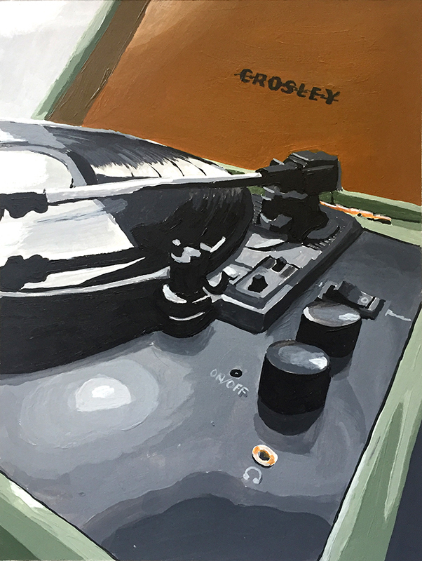
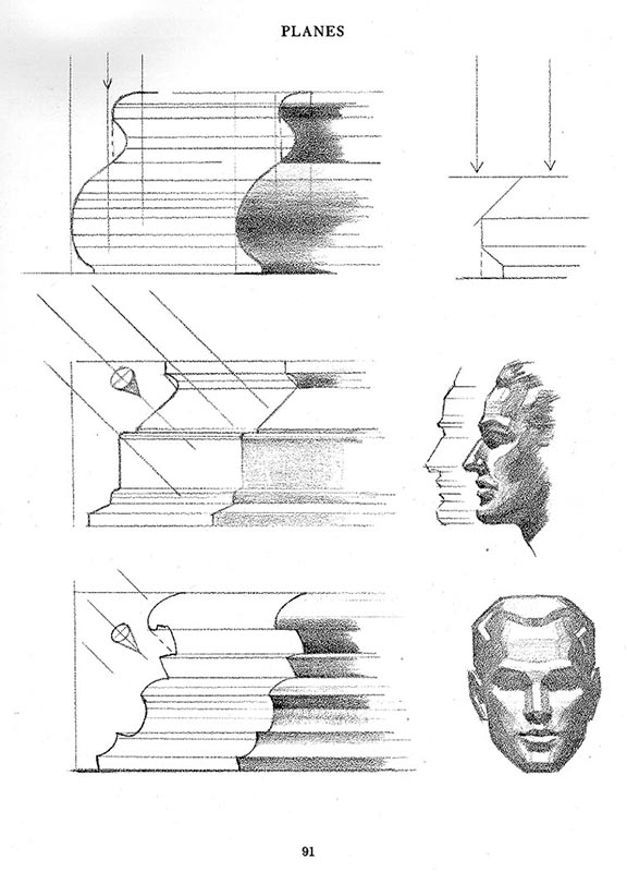
    Planes: In the realm of art, planes are essentially flat surfaces that collectively define the shape and structure of a form. Whether in two-dimensional or three-dimensional art, planes are the building blocks that artists manipulate to create a sense of depth and dimensionality. In two-dimensional art, like drawing and painting, planes are used to represent the various facets of a three-dimensional object on a flat surface, contributing to the illusion of depth. In three-dimensional art, such as sculpture, planes are the literal surfaces that make up the form, each angled uniquely to catch light and shadow, thereby defining the object’s shape and volume.

    Form: Form pertains to the three-dimensional quality of an object, encompassing its volume and the space it occupies. It is the structure or the physical presence of the subject in an artwork. Form is what gives an object its shape and solidity, and it’s perceived through the way planes and contours come together. Understanding form is crucial for artists, as it enables them to create realistic and compelling representations of their subjects, whether in sculpture, painting, or digital media.

    Rendering: Rendering is the artistic process of adding color, shading, texture, and light to the planes and forms, bringing them to life with depth, dimension, and emotion. It is through rendering that an artist conveys the material qualities of the subject, its location in space, and the way it interacts with light. In drawing and painting, rendering involves techniques like shading and highlighting, while in digital art, it can be a complex process involving software and algorithms to simulate realistic appearances.

    Shading: In art, shading refers to the technique of varying tones to represent the effects of light and shadow on the surface of an object, thereby giving it a sense of volume and three-dimensionality. Shading is used to enhance the realism of a subject, indicating where light falls and where shadows are cast. It involves the gradation from light to dark across different surfaces and contours of the subject. Different shading techniques, such as hatching, cross-hatching, stippling, and blending, can be employed to achieve various textures and depths. Shading is a fundamental skill in drawing, painting, and digital art, crucial for depicting the way light interacts with forms and for conveying the atmosphere and mood of a composition.

    Through visual examples and detailed explanations, this page aims to provide a comprehensive understanding of how planes, form, and rendering come together to create compelling art. Whether you are an aspiring artist, a seasoned professional, or simply an art enthusiast, these concepts are crucial for appreciating and creating art that resonates with depth, realism, and emotion.

  • Ink and pen

    Ink and pen

     Super User Beginning Drawing 16 April 2019  Hits: 1062 

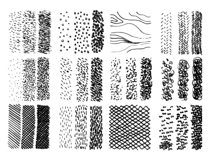
    Lines and marks

    Pattern 

     Stippling 

    Value scale samples

    DIGITAL CAMERA

    Texture

    Samples

  • Project 1 – Line

    Project 1 – Line

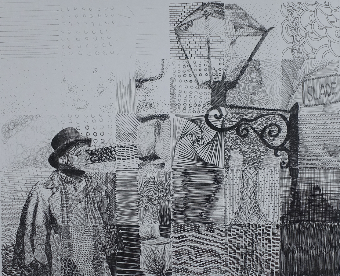
    This project focuses on the exploration and application of line, a fundamental element of art that serves various functions from defining form to creating texture and pattern. Through this exercise, students will delve into the versatility of lines and how they can be manipulated to convey different themes and emotions.

    Line: a mark left by a dot or point moving over a surface. It is often an outline or contour, showing the edge of an object, or figure. They can be horizontal, vertical, diagonal, long, short, straight, curved, thick, thin, solid, dashed, blurred, uneven, sharp-edged and can create patterns. Line can be direct, implied or psychic.

    7 primary functions of line

    • to convey it’s own intrinsic beauty
    • to limit or divide an area or space
    • to delineate an idea or a symbol
    • to define form by edge or contour
    • to catch and direct the eye over a given course
    • to produce a gray or tonal gradation
    • to create design or arrangement 

    Intro to Project 1/Design with line

    Drawing of Jimmy Hendrix

    Line: a mark left by a dot or point moving over a surface. It is often an outline or contour, showing the edge of an object, or figure. They can be horizontal, vertical, diagonal, long, short, straight, curved, thick, thin, solid, dashed, blurred, uneven, sharp-edged and can create patterns. Line can be direct, implied or psychic.

    7 primary functions of line

    1. to convey it’s own intrinsic beauty
    2. to limit or divide an area or space
    3. to delineate an idea or a symbol
    4. to define form by edge or contour
    5. to catch and direct the eye over a given course
    6. to produce a gray or tonal gradation
    7. to create design or arrangement 

    Intro to Project 1/Design with line

    1. Create 50, 1”x 1” squares in your sketchbook. Here’s a pdf sample with what you’re going for. You should also conduct your own research and find other samples online. Get inspiration from different textures, see what you can come up with and have fun with it!
      1. 50 squares will be due on the date on the syllabus
    2. Chose a theme, i.e. film, music, art; or any subgenre; i.e. film-action, film-horror, etc.; music-rock, hip-hop, classical, etc.
      1. your theme will define your artwork and the research you will need to conduct for this project.
    3. You will need to find few photographs that will support your theme. You can print the photos for your convenience, or you can use your phone.
      1. Here are some guidelines on how to chose a successful photo.
        1. Chose a photo that is not complex in detail.
        2. Chose a photo that has a full range of values: meaning it has enough of gray between the lightest light and the darkest dark.
        3. Chose a photo that is not too soft. Softer images are harder to draw from especially for beginning students. 
    4. Create 3-5 thumbnails (small sketches about 2×3 inches) where you will explore the theme. How can you represent a particular theme? If it’s music, chose something you can focus on, maybe an artist or a musical instrument. This will be your “focal point.” Other elements will support that focal point and draw the viewer’s attention to it.
      1. Chose what represents the theme you settled on.
      2. Research your idea and collect as much visual references you can for it (it’s better to have it and not need it, than to need it and not have it).
      3. Select elements that will help visually communicate your theme; i.e. film – cameras, film reels, film strip, director’s chair, etc.; music – instruments, music sheet, sound wave, etc.
        1. in your design, use the elements to tie in the whole design together. 
    5. The final composition will be 10″x12″ inches. It can be either horizontal or vertical, that will depend on your design.
      1. Create 2″x2″ squares that will be 6 squares by 5 squares.
    6. Composition from your thumbnails.
      1. Once you have settled on the thumbnail you like, you will need to enlarge it and create a more detailed version. 
      2. Chose squares from the 50 you have created to fit for those areas. You can manipulate your marks and lines, you can make them larger or smaller to make the value lighter or darker.
        1. TIP The closer your lines are to each other, the darker they will appear when inked, the farther apart, the lighter they will look.
      3. Make it proportional to the final. You can make 1/2 inch squares, or 1 inch squares. When you’re done, this will help you enlarge it to the final 2×2 inch squares. 
      4. Make sure that you are working with squares RECTANGLES WILL NOT WORK AND WILL THROW OFF YOUR PROPORTIONS. 
      5. Draw a rough composition in your sketchbook and arrange values according to your photograph.
    7. Draw, or transfer your composition to the Bristol board and ink it.

    Here is a link to a video demonstrating the process.

    https://youtu.be/dF014xEZkFg

  • Project 2 – Shapes and Value

    Project 2 – Shapes and Value

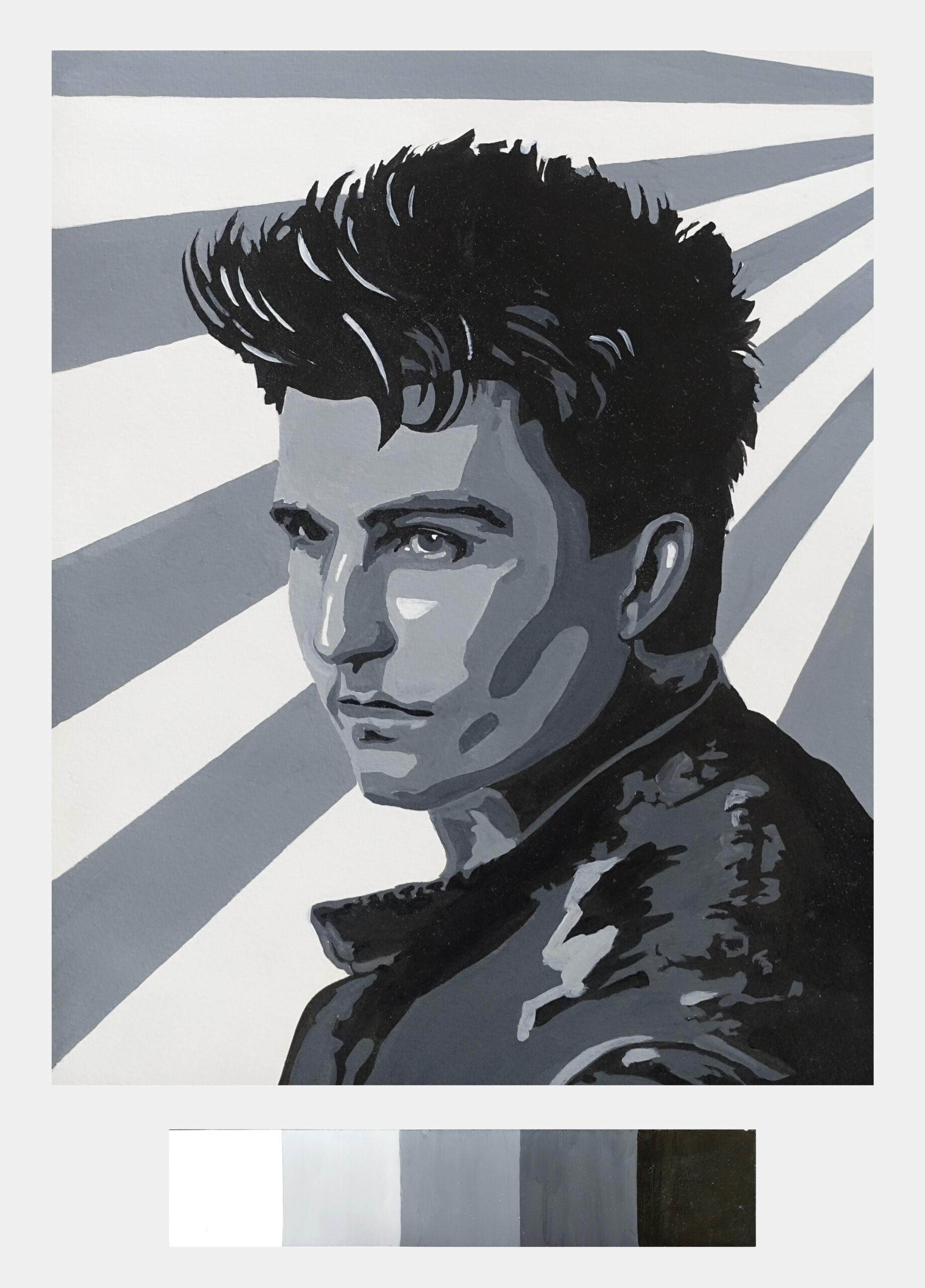
    This will be a portrait focusing on value and shapes.

    Project size 8×10 inches

    Materials: bristol board; graphite pencil; ruler: acrylic paints: Mars black and Titanium white; brush: round small; plastic container for water; rag and plastic plates. Optional: if you have small plastic containers you can utilize them to store premixed paint. Optional: spray bottle.

    We will do another value scale, this time in acrylic. This will help you with your other projects as well.

    1. On a bristol board, make 10, 1×1 boxes with a pencil and a ruler. Using the scale bellow as your guide, mix your paints to create a value string on your board (try to be as accurate as possible). Tip: it takes only a bit of black paint to tint white, however, it will take a lot of white to lighten the black.

    2. When you are finished with your value scale use a hole punch to punch holes in the middle of the squares. You have created a value scale and a finder!

    3. Use your own photograph, or the photo I will be taking for you in class. The photo needs to be black and white and 8×10 inches (this will be the size of the final project). Print the photo on regular paper. Using your value scale start “breaking down” the photo into dominant/major value areas. Tip: if you see gradation, or few values, simplify the values and “favor” the one closer to your scale. Chose 5 values to work with. Simplify any others in between when appropriate.

    4. Once you have decided on your 5 values begin to “break down” the major areas. Use a pencil and trace directly on your print out. See examples bellow. Tip: keep your lines clean, fluid and organic. Remember, you are designing, not tracing! It is up to you to determine how the line should flow. The photograph is only a reference!

    Remember. Creative art comes from creative line and it hast to come from you!

    Always have the courage to “draw it yourself!”
    Andrew Loomis

    5. When you are confident with your value study and lines, you can transfer your your drawing to a bristol board, 8×10 inch area and begin painting. Leave some room at the bottom of your page to include the 5 values you have chosen. If you do not have room, you can do it on a separate piece of bristol, cut it out and place it under the final project (I will talk about mounting your pieces before the final).

    Process demo

    Student work samples

  • Project 3 – Abstract

    Project 3 – Abstract

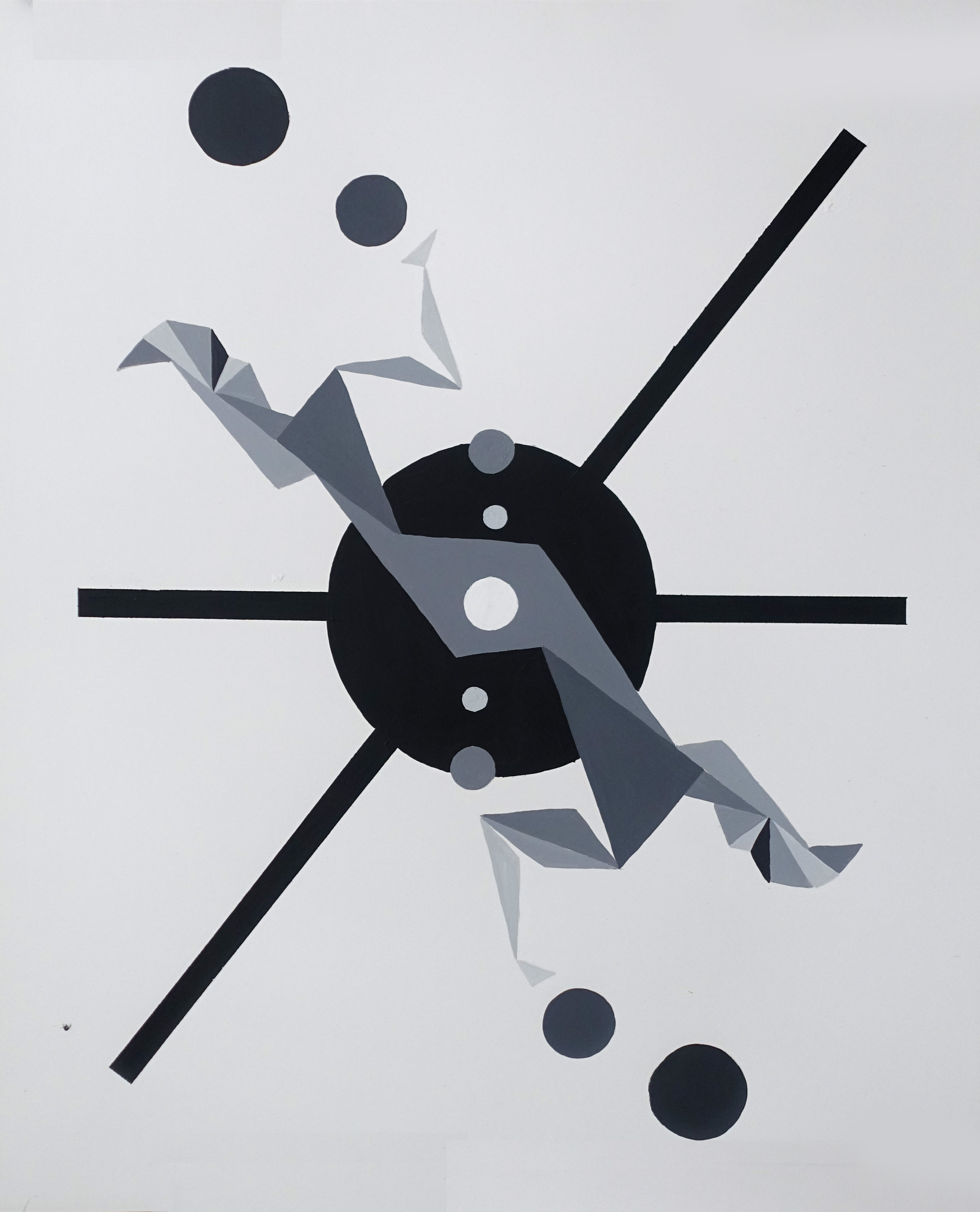
    Pre-history on abstract art.

    In the beginning of the 20th century a new wave of art, the avant-garde, was formed. It was a wide-spread cultural phenomenon that involved many different movements and styles.

    • Avant-garde: “advance guard” or “vanguard”, literally “fore-guard.” 

    In the 1910s Kazimir Malevich, drawing from different movements, came up with a new one, which he called Suprematism. In later years this movement gave rise to Constructivism.

     Like many other movements, Constructivism didn’t happen on its own. It was a product of other ideas, concepts and art movements that were taking place in the early 20th century and even late 19th century.

    There are several movements that influenced Constructivism: Cubism, Futurism and Supremacism.

    Cubism: An artistic movement that began in France in the early 20th century (1907-1914). Two of the key figures in the movement are Georges Braque and Pablo Picaso. Many art historians believe that  Paul Cézanne laid the groundwork for cubism.

    Key ideas/concepts:

    • Abandon perspective and realistic modeling and rendering of figures in favor of flattened, geometric representations of objects and people.
    • Geometric, fractured forms, muted, depthless colors and unspecified edges. 
    • Allowing space to flow through open form with piercing figures and objects was something Cubists explored.
    • Showing objects from various angles in the same image.
    • It is argued by some historians that these innovations came about as a response to the changing experience of movement, space and time in the modern world. This marked the first phase of the movement and was called Analytic Cubism.
    • In the second phase of Cubism, Synthetic Cubists explored the use of non-art materials as abstract signs. Their use of newspaper would lead later historians to argue that, instead of being concerned above all with form, the artists were also acutely aware of current events, particularly WWI.

     Futurism: It is considered to be the most important Italian art movement of the 20th century. It was launched by Italian poet Filipo Marinetti in 1909 in his Manifesto of Futurism. Futurism, like other art movements of its time, is part of the avant-garde movement. It wished to destroy the old forms of culture and demonstrate the beauty of modern life. In its early stages Futurism was not identified by a distinct style. Rather, it was eclectic, borrowing from other styles and movements largely from Impressionism, Pointillism and Surrealism. The actual style emerged in 1911 and was a product of Cubism.

    Key ideas/concepts

    • The artists were captivated and fascinated by the problems of representing human experiences in a modern world. Futurists attempted to have their paintings evoke sensations not only visual, but bring to mind noise, heat and even the smell of the metropolis.
    • New technology fascinated Futurists. Chrono-photography allowed the movement of an object to be shown across a sequence of frames. This is a predecessor of animation and cinema. This influenced the painting. Futurists tried to convey this in painting with rhythmic, pulsating qualities.

    Suprematism:

    Suprematism was the invention of a Russian artist Kazimir Malevich. It was one of the earliest and most radical developments in abstract art. The first indications of it emerged in costume and background sketches that Malevich designed in 1913 for Victory Over the Sun, a Futurist opera performed in St. Petersburg. Its name derived from Malevich’s belief that Suprematist art would be superior to all the art of the past, and that it would lead to the “supremacy of pure feeling or perception in the pictorial arts.” Heavily influenced by avant-garde poets, and an emerging movement in literary criticism, Malevich derived his interest in flouting the rules of language, in defying reason. He believed that there were only delicate links between words or signs and the objects they denote, and from this he saw the possibilities for a totally abstract art. And just as the poets and literary critics were interested in what constituted literature, Malevich came to be intrigued by the search for art’s barest essentials. It was a radical and experimental project that at times came close to a strange mysticism. Although the Communist authorities later attacked the movement, its influence was pervasive in Russia in the early 1920s.

    “From Cubism to Futurism to Suprematism: new reality of painting.”

    Malevich wanted to go further and create a new type of object-less art; an art that would allow him to abandon any annotation to nature and focus solely on color and creativity in its purest form.

    Key ideas/concepts

    • Search for ‘zero degree’ of painting. This would be a point beyond which the medium could not go without ceasing to be art. The idea itself pushed/forced simple motifs: the square, circle and cross became the group’s favorite motifs.
    • Texture of paint became an essential quality of the medium of painting.
    • Though much Suprematist art can seem highly austere and serious, there was a strong tone of absurdism running through the movement. One of Malevich’s initial inspirations for the movement was zaum, or transrational poetry, of some of his contemporaries, something that led him to the idea of ‘zaum ‘
    • The Russian Formalists, an important and highly influential group of literary critics, who were Malevich’s contemporaries, were opposed to the idea that language is a simple, transparent vehicle for communication. They pointed out that words weren’t so easily linked to the objects they denoted. This fostered the idea that art could serve to make the world fresh and strange, art could make us look at the world in new ways. Suprematist abstract painting was aimed at doing much the same, by removing the real world entirely and leaving the viewer to contemplate what kind of picture of the world is offered by, for instance, a Black Square (c. 1915).

    Constructivism: It was the last and most influential modern art movement to flourish in Russia in the 20th century. Vladimir Tatlin, Malechiche’s contemporary, is often hailed as the father of Constructivism. He had collaborated on the preceding Cubo-Futurist movement. During his visit to Paris in 1913 and seeing Picasso’s wooden reliefs, his interests shifted.

    Tatlin appreciated that the reliefs were not carved or modeled in a traditional manner but composed in an entirely different way (indeed they could be said to be ‘constructed’), put together from pre-formed elements. On his return to Russia, Tatlin began to experiment with the possibilities of three-dimensional relief, and to use new types of material with a view to exploring their potential.

    • Constructivists proposed to replace art’s traditional concern of composition with a focus on construction.
    • Organization of abstract geometric elements that would allow, when combined, to create a dynamic and visually stable forms
    • Photography and photomontage – part of canvas, all aspects of transmitting an artist’s idea.
    • Combination of different fonts to delineate their symbolic or literal meaning.
    • Simple, flat, symbolic colors. Conveying an image without volume and, or perspective.
    • Large white space as part of the design.

    Goal of Constructivism

    The main goal of Constructivism was to depict the experience of modern-day life, its dynamic and new, disorienting qualities of space and time through posters and canvases.


    KEY ARTISTS

     
    Influence on contemporary works.

    BAUHAUS

    Literally “construction house.”

    After WW1, Henry van de Velde, the master of the Grand Ducal Saxon School of Arts and Crafts had to resign due to being Belgian (1915). He recommended Walter Gropius to succeed him. In 1919 Gropius became the master of the school. It was this art school that Gropius transformed into the world-famous Bauhaus. The school emerged out of late-19th-century desires to reunite the applied arts and manufacturing, and to reform education.

    Gropius called for the school to show a new respect for craft and technique in all artistic media, and suggested a return to attitudes to art and craft once characteristic of the medieval age, before art and manufacturing had drifted far apart. Gropius envisioned the Bauhaus encompassing the totality of all artistic media, including fine art, industrial design, graphic design, typography, interior design, and architecture.

    Characteristics of Bauhaus design

    • Geometric, functional and modern
    • Order, asymmetry
    • Rectangular grid structure
    • Circles, squares, rectangles, triangles, bars, and rules to unify or separate elements versus being used for decoration
    • Horizontals and verticals were dominant
    • Extreme contrast in type size and weight to achieve various degrees of emphasis
    • Type and pictures sized to the same column width
    • Typography without capitals – San Serif
    • Introduction of flush left – rag right typography
    • Copy rotated 90 degrees
    • Only structurally essential components used
    • Elementary forms and the use of black plus one bright hue
    • Color tints emphasize key words
    • Open composition on an implied grid system of sizes for type, rules, and pictorial images brought unity to the designs

    KEY ARTISTS


    Wassily Kandinsky

    One of the pioneers of abstract modern art, Wassily Kandinsky exploited the evocative interrelation between color and form to create an aesthetic experience that engaged the sight, sound, and emotions of the public. He believed that total abstraction offered the possibility for profound, transcendental expression and that copying from nature only interfered with this process. 

    “Colour is the keyboard, the eyes are the hammers, the soul is the piano with many strings. The artist is the hand which plays, touching one key or another, to cause vibrations in the soul”. 

    Key ideas/concepts

    • Kandinsky viewed non-objective, abstract art as the ideal visual mode to express the “inner necessity” of the artist and to convey universal human emotions and ideas. He viewed himself as a prophet, whose mission was to share this ideal with the world for the betterment of society.
    • Kandinsky viewed music as the most transcendent form of non-objective art – musicians could evoke images in listeners’ minds merely with sound. He strove to produce similarly object-free, spiritually rich paintings that alluded to sounds and emotions through a unity of sensation.
    • Kandinsky viewed music as the most transcendent form of non-objective art – musicians could evoke images in listeners’ minds merely with sounds. He strove to produce similarly object-free, spiritually rich paintings that alluded to sounds and emotions through a unity of sensation.

    In 1921, when architect Walter Gropius invited Kandinsky to Germany to teach at the Weimar Bauhaus, he accepted and moved to Berlin with his wife, gaining German citizenship in 1928. As a member of the innovative school, Kandinsky’s artistic philosophy turned toward the significance of geometric elements – specifically circles, half-circles, straight lines, angles, squares, checkerboards, and triangles. 

    Other examples for the project

     Student work

  • Project 4: Distilled Interior

    Project 4: Distilled Interior

    Perspective

    1 point perspective

     Project 4: Distilled Interior

    1. Work on composition sketches for project #4
      1. Chose an area of the room to sketch from.
        1. 1 point, or 2 point perspective.
      2. Focus on a close up (this is a distilled interior).
      3. Optional: you can practice your perspective in class, but if you like, you can chose something from your house for the project.
        1. Do few sketches of different angles, chose the best one and take a photo of it. You can combine the observation and the photo for the project.
    2. Here’s a pdf link for the color chart exercise. 
  • Project 5 alternative

    Project 5 alternative

    This assignment will be focusing on advertisement design.

    What is an advertisement design?

    It is an area of graphic designs that includes illustration, photography, web design, print design and video design. For this assignment you will be keeping in mind illustration and print design. Illustration focuses on storytelling, while graphic design aims to get an idea across, or sell a product. In general, advertisements are used to sell, enlighten or persuade people on a product or an idea.

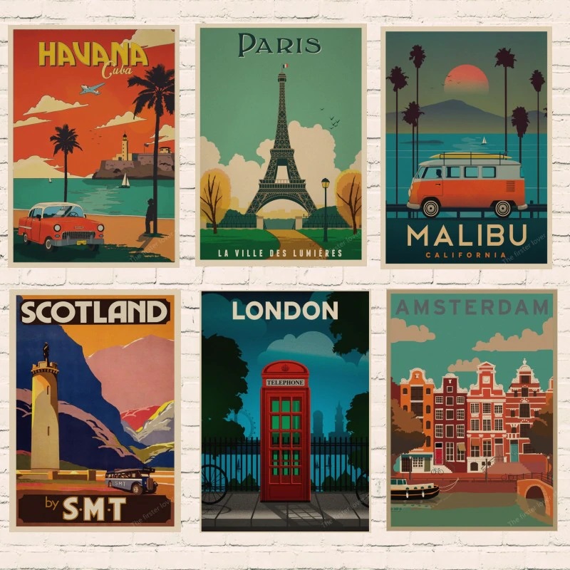
    What are travel posters?

    Historically, travel posters were used not only to sell a destination, but were also used by hotels, airlines, railroads and tourism companies to visually represent those companies, or locations. The styles that were incorporated in the design ranged from art nouveau, art deco and to mid-century modern design.

    The boom of technological marvels of the 20th century such as railroads, airplanes and ocean liners, served as inspiration for many of the images created for travel posters. They also provided people the freedom and accessibility to travel and explore the world like never before. This boom in technology and travel sparked the “Golden Age of Travel” that was interrupted and changed by events of World War II.

    After WWII, when travel picked up again, it were the skies that captivated imagination and the “romance” of travel. This new era of intercontinental air travel allowed people to travel more and arrive faster to their destinations. This period truly became the boom for travel posters. They were found everywhere. Over the decades the designs have gone many transformations. First designs were crowded with text and images that conveyed information.

    Designers who are credited with transforming and simplifying the travel posters in the early 1900s were: Hugo d’Alesi (France), Emile Cardinaux (Switzerland) and Adolfo Hohenstein (Italy). The early 20th century saw a huge boom in diversity in art movements and this helped direct the shift in design by the 1920s. The individuals where pioneered and changed the designs were: A. M. Cassandre, his pupil Fix-Masseau, Tom Purvis, Frank Newbould and other artists. They altered the travel poster from illustration to symbol. In contemporary context, travel posters continue to evolve and change, using preceding styles while combining them with new ideas.

    What are the characteristics good advertisement art?

    “Posters reflect our culture and are like visual graphic icons of the times in which they were created.”  ~ Robin Shepherd, travel poster collector.

    Characteristics of Good Advertisement Art

    “Posters reflect our culture and are like visual graphic icons of the times in which they were created.”  ~ Robin Shepherd, travel poster collector.

    The most essential characteristic of advertisements is simplicity, but not to the sacrifice of good design. The artwork must easily and accurately communicate the destination. This can be done by incorporating a recognizable landmark, cultural elements or landscape.

    Second most important elements of design is the focal point. Where does the artist want the viewer to look?

    1. Decide on the location you would like to advertise.
      1. Research the location and recognizable landmarks.
      2. Do some brainstorming – 5 thumbnails of your ideas.
      3. You an also collage together photos to create a composition.
        1. Consider POV (point of view) where is the horizion placed, how does it effect the viewer’s mood, feel, attitude?
          1. e. do you want the viewer to feel small in comparison the awe of the landscape? Consider a low horizon line that will place the viewer at the bottom.
    2. Color and value. You are now familiar with value, shape and color. This project will incorporate the previous ones in terms of those things.  
      1. Chose 2 colors to begin with. You can chose a dominant color and then “accent” your landmark by using an analogous color.
    3. Typography: incorporate the location in your image with typography. You can incorporate it within your image (more challenging), or include it as a separate box at the bottom of your design (see samples below).
      1. When choosing a font for your image, consider how it speaks of the location itself. In the example below “Los Angeles” has an Art Deco feel to it. This hints at the old Hollywood era of film as well as the city’s earlier architecture and designs. 
      2. You can visit this site: dafont.com and do some research, or chose from fonts on your computer. You don’t have to stick to the font exactly, you can use your reference as a starting point and modify it, or design your own.
    4. If you feel that your design needs more colors, try to limit them and use value to shift foreground and background elements.Dimensions of the project: no smaller than 6×10. You can go larger if you like, but keep in mind the aspect ratio of 8.5×11 inches.  This way, if you chose to scan your work and print it, you will be able to print it on a standard 8.5×11 poster size.
  • Color Theory

    Color Theory

     Light – the phenomenon of light which creates the visible spectrum helping us to distinguish one hue form from another. Light is waves. Each wave of different length caries different information creating different hues.

    Visible spectrum consists of ROYGBIV: Red, Orange, Yellow, Green, Blue, Indigo and Violet. One way to memorize the order of the rainbow is to think of it as a name Roy G. Biv.

    White light is the combination of all of the above.

    Our perception of color is different from other animals.

    What happens to light when it travels? 

    Light: reflect (mirror, glass), absorb (wood), transmit (diamond, glass), refract (straw in water), scattering (clouds, fluorescent lights).

    How objects transmit color?

    A red apple will absorb all waves except red, which is reflected.

    White reflects all wavelengths.

    Black absorbs all wavelengths. As a result it stores heat.

    Color will change depending on the light sourse. 

    Color through history:

    Aristotle developed the first known theory of color. According to him, God sent down color from heaven in form of celestial rays. His color theory evolved around four elements: earth (black), fire (white), wind (red) and water (yellow). 

    Even though scientists and artists alike tried to come up with different versions of color theory, Aristotle’s version remained influential for nearly 2000 years. 

    Aron Sigfrid Forsius, a Finish astronomer, invisioned the first color solid (seeing color in three dimensions: hue, saturatoin and value). The system originated in 1611 in a text by the author on physics. It consisted of (Black, white), red, yellow, green-blue.

    Robert Fludd, a physician, created the first color wheel around 1629-1631 based on Aristotle’s theory.

    Sir Isaac Newton is credited with creating the first color wheel based on relationship of colors/hues. He conducted a series of experiments that he publishes in 1672 outlining his discovery.

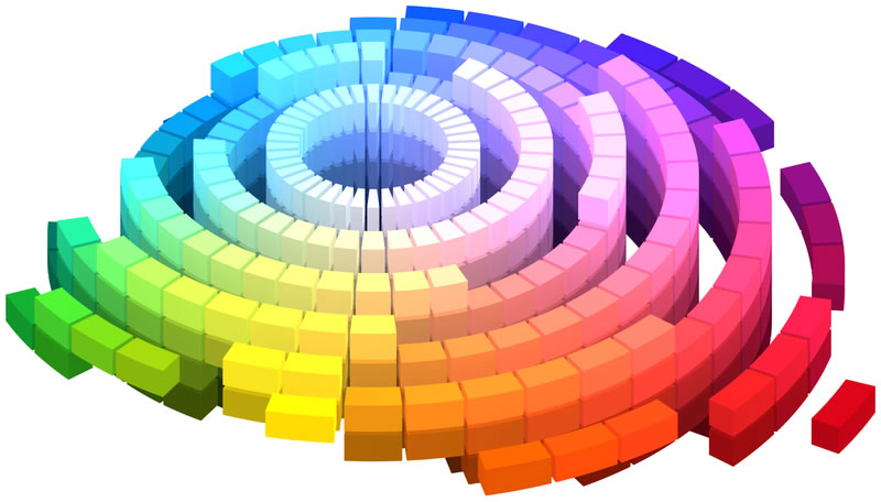
    Albert Henry Munsell an American artist, teacher and the creator of the Munsell Color System. The system is setup similar to the metric system. It is divisible by 5. First, Munsell setup the gray scale on the vertical with black at the bottom and white at the top. Next, he organized the chroma (intensity) moving away from the center. The further away from the center the more intense the color is. Finally, the hue is arranged at different angles producing away from the center, neutral colors. 

    Color mixing.

    Additive: mixing color with light RGB (Red, Green and Blue).

    Additive colors: combine light sources in order to create color. Adding Red and Green makes Yellow. The reason for this is that Yellow wavelength is present in both and when combined, Red and Green cancel each other out leaving only visible Yellow.

    This is the way screens work, they illuminate color instead of reflecting it.

    Subtractive: mixing pigments: mixing pigments to create a desired hue.

    The reason why it’s called that is because when mixing pigments you are partially or completely subtracting (that is, absorbing) some wavelengths of light and not others.

    Color theory creates a logical structure for:

    Color Wheel, Color Harmony and Color Context.

    Color Wheel

    Primary colors: yellow, red and blue.

    Secondary colors: orange, violet and green.

    Tertiary colors: yellow orange, red-orange, red-violet, blue-violet, blue-green, and yellow-green.

    Tone, tint and shade

    Color Harmony: a pleasing arrangement of parts. Harmony delivers visual interest and sense of unity and order.

    Achieving Harmony:

    Analogous are any three colors side by side on the color wheel.

    Complimentary colors are colors that lie directly opposite each other. This will give you greatest contrast.

    Split complementary: the split complementary takes the two colors directly on either side of the complementary color.

    Triadic harmony: three equally distanced colors on the color wheel.

    James Gurney

    Color schemes based on nature

    Color context: How color behaves in relation to other colors and shapes.

    The relationship of values, saturations and the warmth or coolness of respective hues can cause noticeable differences in our perception of color.

    Compare the contrast effects of different color backgrounds for the same red square.

    Red appears more brilliant against a black background and somewhat duller against the white background. In contrast with orange, the red doesn’t stand out as much; in contrast with blue-green, it exhibits brilliance. Notice that the red square appears larger on black than on other background colors.

    References

    http://gurneyjourney.blogspot.com/search?q=color+harmony
  • Principals of composition

    Principals of composition

    Principles of Composition: Principles, on the other hand, are guidelines or concepts that artists use to organize and arrange the elements within their compositions effectively. Principles help artists achieve balance, harmony, rhythm, unity, emphasis, contrast, and other aesthetic qualities in their artworks. Unlike elements, principles are abstract and conceptual in nature. They provide a framework or set of rules that artists can follow to create visually pleasing and meaningful compositions. Principles govern the relationships between elements and guide the overall structure and organization of the artwork.

    It is how the elements of art and design—line, shape, color, value, texture, form, and space—are organized or composed according to the principles of art and design—balance, contrast, emphasis, movement, pattern, rhythm, unity/variety—and other elements of composition, to give the painting structure and convey the intent of the artist.


    Unity: all elements, or parts of the composition belong together.

    Harmony: similar to unity, but differs in a way “how those elements relate to each other.”

    Balance:  refers to arrangement of shapes, form, color, etc. to give a sense of balance. Balance could be symmetrical, asymmetrical, or radial.

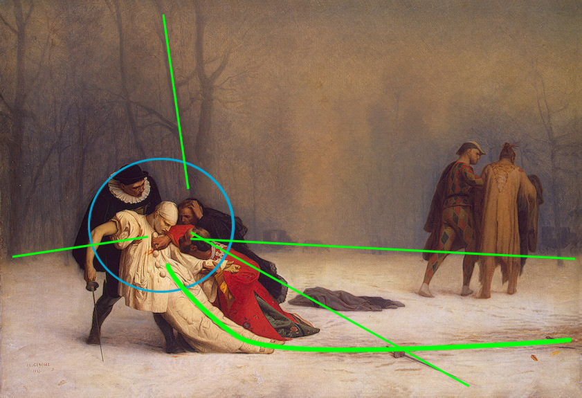
    Movement: sense of movement in a static composition can be achieved by arrangement of objects and position of figures. Leading lines can direct the viewer’s eye into and around the composition. Leading lines can be actual, implied, or psychic.

    Rhythm: similar to music, visual composition can have rhythm. It refers to the relative repetition and/or variation of visual elements that often leads to rhythm, visual interest, and control of the viewer’s eye direction throughout a composition.

    Focus (Emphasis, or focal point): A compositional device emphasizing a certain area or object to draw attention to the piece and to encourage closer scrutiny of the work.

    Contrast: Refers to the differences in values, colors, textures, shapes and other elements. Contrast can add interest to the work. Black and white creates the highest value of contrast. It is the use of several elements of design to hold the viewer’s attention and to guide the viewer’s eye through the artwork.

    Pattern: A regular repetition of lines, shapes, colors, or values in a composition.

    Proportion: refers to the relative scale of one form in relationship to another form.

  • Elements of composition

    Elements of composition

    Elements of Composition: Elements are the basic building blocks or fundamental components that artists use to create their artworks. These elements include line, shape, form, space, color, value, texture, and more. Elements are tangible and concrete aspects of the artwork that can be identified and manipulated. Artists use these elements to convey their ideas, express emotions, and communicate with their audience. Elements provide the raw materials from which compositions are constructed.

    • Line
    • Shape
    • Value
    • Space
    • Texture
    • Color

    Line: a mark left by a dot or point moving over a surface. It is often an outline or contour, showing the edge of an object, or figure. They can be horizontal, vertical, diagonal, long, short, straight, curved, thick, thin, solid, dashed, blurred, uneven, sharp-edged and can create patterns. Line can be direct, implied or psychic.

    7 primary functions of line

    1. to convey it’s own intrinsic beauty
    2. to limit or divide an area or space
    3. to delineate an idea or a symbol
    4. to define form by edge or contour
    5. to catch and direct the eye over a given course
    6. to produce a gray or tonal gradation
    7. to create design or arrangement 

    Shape: are created when lines are combined to form a square, triangle, or circle. Shapes can be organic (irregular shapes found in nature) or geometric (shapes with strong lines and angles such as circles, triangles, and squares).

    Value: is the degree of light and dark in a design. It is the contrast between black and white and all the tones in between. Value can be used with color as well as black and white. Contrast is the extreme changes between values.

    Space: the area between and around objects. Increasing or decreasing the amount of space around an object affects the way we view that object.

    Texture: is the surface quality that can be seen and felt. Textures can be rough or smooth, soft or hard. Textures are often implied. For instance, a drawing of a rock might appear to have a rough and hard surface, but in reality is as smooth as the paper on which it is drawn.

    Color: is the phenomenon of light which creates the visible spectrum helping us to distinguish one form from another. Color has hue, value, saturation (intensity).